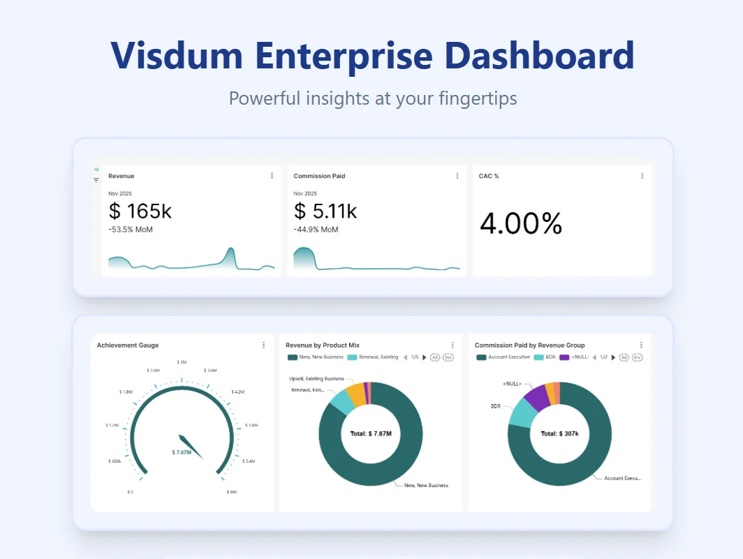
Visdum’s Enterprise Dashboard: Real-Time Performance Clarity
.webp)
In most enterprises, data sits across CRMs, spreadsheets, and dashboards that don’t update in real time, even though sales does. This lack of clarity creates a delay between what’s happening and when leaders can see it, resulting in decision lag. By the time performance data is reviewed, the sales behaviors that shaped the outcome are already locked in.
Traditional dashboards weren’t built to operate at this level of enterprise complexity. As McKinsey points out, “Organizations that fail to make data-driven decisions risk losing up to 20% of their operating margin.” In organizations, that loss often comes from decisions made too late or not made at all.
Visdum’s Enterprise Dashboard addresses this by bringing commissions and sales performance into a single, live view, giving enterprise leaders clarity on incentives, attainment, and pacing across teams and regions, while there’s still time to intervene.
The Visibility Gap That Costs Teams Their Quarter
As enterprises scale, sales commission structures become increasingly layered. New plans are introduced, accelerators change, territories shift, and exceptions multiply. What may have worked at a smaller scale quickly turns fragile, slow, and difficult to trust.
This complexity doesn’t break in one place; it surfaces across multiple teams, creating gaps in how performance and payouts are managed. Let’s take a closer look at how the visibility gap affects diverse enterprise teams:
Finance & Operations: When Accuracy Depends on Manual Effort
The gap:
Commission and incentive calculations involve multiple plans, territories, accelerators, and exceptions. Yet many finance and operations teams still rely on spreadsheets and manual checks to hold everything together.
What this leads to:
Reconciliation turns into a recurring fire drill. Teams spend most of the time validating numbers, correcting errors, and resolving payout questions. Without a reliable source of truth, accuracy depends on effort rather than systems, and trust erodes over time.
Sales Teams: When Payouts Feel Opaque
The gap:
Reps don’t just want to know what they earned, they want to understand how they earned it. When calculations aren’t visible or easy to follow, confidence in the system drops. Without clarity on how deals, accelerators, or thresholds affect earnings, reps struggle to adjust their behavior during the quarter.
What this leads to:
Disputes increase after payouts, motivation dips during the quarter, and incentives lose their effectiveness. When earnings feel unclear, performance becomes reactive instead of intentional.
When payouts aren’t transparent, incentives stop being motivating.
Sales Leadership: Decisions Made on Gut, Not Data
The gap:
Leaders often have access to data, but not insight. Reports are static, metrics lag behind reality, and performance is viewed in averages that hide early warning signs.
What this leads to:
Coaching opportunities are missed, interventions come too late, and forecasts are built on incomplete context. Without clear visibility into who is ahead, who is falling behind, and why, decisions rely more on intuition than evidence.
Why Traditional Dashboards Weren’t Built For Modern Sales
Most organizations already have dashboards. That’s not the problem. The problem is that these dashboards were designed to report numbers, not to support decisions at scale.
.webp)
- They are built for reporting, not decision-making.
Most dashboards focus on summarizing past performance instead of helping leaders act on what is happening right now. - Views are static and predefined.
Fixed layouts and charts leave little room to explore data based on role, context, or changing business questions. - They follow a one-size-fits-all approach.
Everyone sees the same dashboard, regardless of whether they are in finance, sales leadership, or operations, reducing relevance and usefulness. - Slicing across dimensions is limited.
Analyzing performance by territory, segment, product, or time often requires switching reports or exporting data into spreadsheets. - Insights lack context and direction.
Metrics are presented in isolation, without explaining why trends are happening or where attention is required. - Actionability is missing.
Dashboards highlight outcomes but fail to surface risks, momentum shifts, or priority areas early enough to intervene.
A dashboard that only reports the past is not a decision system, it’s a history lesson.
How Visdum’s Enterprise Dashboard Turns Insight Into Action
Most dashboards stop at visualization. They show charts, trends, and totals but leave leaders to figure out what actually matters. Visdum’s Enterprise Dashboard is built differently. It is designed to help leaders of enterprises to move quickly from data to decisions. Instead of scattering metrics across multiple views, insights are structured so what matters surfaces first.
- Metrics are logically grouped to show performance in context
- A clear hierarchy guides attention from KPIs → trends → contributing factors
- Analytics are built for in-the-moment decisions, not post-quarter analysis\
Slice and Dice Performance Across Any Dimension
Performance questions rarely come pre-defined. Leaders want to explore data based on what they’re seeing in the moment, by territory, market segment, product line, time period, or individual teams.
.gif)
Visdum’s Enterprise Dashboard is designed for this kind of exploration. There are no rigid views or locked reports. Leaders can slice and analyze performance across any relevant dimension, follow signals as they emerge, and dig deeper without exporting data or switching tools.
This flexibility turns the dashboard into an active thinking space rather than a static reporting surface.
Role-Based, Business-Specific Views
There is no single “right” view of performance. Visdum’s Enterprise Dashboard is highly customizable and tailored to how each role operates.
Role-based views for:
- Finance and RevOps
- Sales Reps
- Sales leadership
Fully customizable:
- Layouts
- Chart types
- KPIs
- Dimensions
Every dashboard is configured based on role, business structure, and decision needs, so leaders see what’s relevant, not everything.
Designed to Engage, Not Overwhelm
Even the most powerful analytics are useless if no one engages with them. That’s why visual design plays a critical role in decision-making. Visdum’s Enterprise Dashboard has -
- Purpose-driven charts designed for clarity, not decoration.
- Clear visual hierarchy that directs attention to what matters most.
- No clutter. No vanity metrics.
.gif)
Visdum’s Enterprise Dashboard is designed to be engaging, intuitive, and actionable, so insights don’t get ignored and decisions don’t get delayed.
Unlike many sales and compensation platforms that require complex ETL pipelines and long setup cycles, Visdum is designed to work out of the box. Its plug-and-play integration connectors sync directly with existing systems, while still supporting advanced use cases like multi-plan commissions, dynamic segmentation, and real-time performance analysis.
“If you want to drive performance and motivation, analytics can’t just exist, they have to be actionable. People need to be able to understand what the data is telling them and what to do next.”
— Sameer Sinha, Co-founder & Head of Product at Visdum
Watch a short walkthrough of Visdum’s Enterprise Dashboard to see how leaders get real-time visibility into sales commissions and performance:
Dynamic Heat Maps For Real-time Quarterly Performance Tracking
Quarterly performance rarely moves evenly; some people pull ahead early, some stay steady, and others quietly fall behind without triggering obvious alarms. One of the key features of Visdum’s Enterprise Dashboard, the Dynamic Heat Map, is built to surface these signals early.
.gif)
It translates complex performance and payout data into clear visual cues that show how individuals are pacing within a quarter, giving leaders a live view of who is ahead, who is on track, and who is at risk, without waiting for static reports or end-of-period summaries.
.webp)
In the table above, color intensity reflects payout strength across different components within the quarter.
Darker green highlights stronger payouts and healthier pacing. Lighter shades indicate partial progress. Rows with little or no color flag zero or low payouts, signaling where performance is lagging or where conditions haven’t been met yet.
This allows leaders to quickly understand:
- Who is consistently performing across components
- Where performance drops off between tiers
- Which individuals need attention, coaching, or support right now
Because the heat map is fully customizable, this view can be sliced by time period, component, territory, or individual role, depending on how leaders manage performance. The result is faster insight, better conversations, and timely intervention while outcomes can still be influenced.
“Before Visdum, our leadership team was always reacting after the quarter ended. Now we can see performance gaps early and course-correct in real time. It’s changed how we run reviews and coaching entirely.”
— Head of Sales Operations, London-based Fintech Giant
Early outcomes teams have reported include:
- Up to 50 - 60% reduction in commission reconciliation time for finance and RevOps teams
- 40–50% fewer payout-related disputes due to clearer visibility and transparency
- Faster decision cycles, with leaders identifying performance risks weeks earlier than before
The Difference an Enterprise Dashboard Makes
.webp)
Conclusion
At its core, an enterprise sales compensation dashboard exists to support better leadership decisions. When commission and performance data are brought together, easy to understand, and surfaced at the right moment, leaders spend less time reconciling numbers and more time guiding behavior with confidence.
As Peter Drucker put it, “The best way to predict the future is to create it.” In the context of enterprise sales, that creation depends on clarity, being able to see how incentives, attainment, and payouts are evolving early enough to intervene, course-correct, and reinforce the right actions.
The real value of an enterprise dashboard isn’t how much data it shows. It’s how clearly it connects performance to commissions, so leaders can see what’s driving outcomes, make timely decisions, and move forward with purpose.
.webp)
FAQs
1. Who is this Enterprise Dashboard meant for?
Primarily for sales leaders, finance, and RevOps teams who need a clear view of performance. Sales reps benefit too, but the biggest value is for leadership decisions.
2. Can leaders customize the dashboard based on their role or business structure?
Yes. An enterprise dashboard is highly customizable. Layouts, KPIs, chart types, and dimensions can be configured based on role and business needs. This ensures that each user sees information that is relevant to how they make decisions, rather than a one-size-fits-all view.
3. Can different people see different views?
Yes. Views can be tailored so leaders, finance, and RevOps each see what matters to them.
.avif)
.avif)
.webp)

